
Starmind
A Design System for Consistency, Speed and Collaboration
Team
Vanessa Trantes - UX Designer
Moon Löffler - UX Designer
Timeline - 5 Months
Imagine This…
The product is growing, the features are rolling out—and an unstructured design system starts becoming more and more of a burden.
One designer overrides another’s work without realizing.
The developer isn’t sure which button is the “right” one.
The marketing team opens a file and finds a completely different set of styles.
At Starmind, a Zürich-based SaaS company building AI-powered knowledge networks for large organizations, we had just made the shift from Sketch to Figma—hoping for better collaboration and smoother handoff across teams. But the transition revealed deeper cracks: inconsistent patterns, clashing styles, duplicated components, and growing confusion between design, development, and marketing.
It became clear: we didn’t just need a better tool.
We needed a shared language.
We needed a design system.


Goals
-
Improve collaboration across teams by introducing a shared system between designers and developers.
-
Increase consistency and efficiency in the design process by reducing redundant elements and creating reusable components.
-
Make onboarding easier for new team members with clear documentation and visual guidelines.
-
Support a smooth transition from Sketch to Figma and future-proof the design workflow.
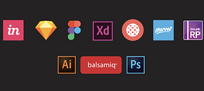
Before diving into building the system, we took time to research the best tools and programs to support our workflow. Since we were making the switch from Sketch, we explored platforms like Figma & Adobe XD, and a few more.
Our main criteria were collaboration, version control, developer handoff, and scalability. After comparing features and testing a few in real-world scenarios, we landed on Figma as the best fit for our needs.
We kept a copy of the documentation in Confluence in order for easy access for Marketing, PM's and other people in the company who ma not be used to Figma.

Design Audit
We began with a full design audit to assess the current state of our product. This meant gathering everything that existed—user flows, UI elements, typography, colors, illustrations, icons, buttons, dropdowns, and interaction patterns—for both mobile and desktop.
From there, we sorted and categorized each element, identifying redundancies and opportunities to consolidate. We also evaluated accessibility across the board: checking contrast, readability, alt text, and more.
To ensure alignment, we met with developers to review their component library and spot inconsistencies, and we connected with the marketing team to ensure visual cohesion across all brand touchpoints.

Building the System
Vanessa and I carved out time weekly to build the system collaboratively, while taking Figma tutorials and also managing other design responsibilities. Our approach:
-
Used the existing visual identity as a base, refining for clarity and scalability
-
Borrowed proven structures from existing design systems
-
Focused on practical use — creating components we’d actually reuse across flows
-
Worked closely with developers to align names, styles, and behavior

We created a living design system guide — accessible to anyone at Starmind. Our priorities:
-
Clear, plain language (no jargon)
-
Visual examples for each element
-
Guidance on when and how to use each component
-
FAQs and tips based on real internal questions
We regularly tested our documentation by sharing it with non-design colleagues and incorporating their feedback.
Implementation was a gradual process that required close coordination with developers. Since their schedules were packed with other priorities, we broke the work into small, manageable tickets and tackled them step by step.
This incremental approach helped us steadily roll out changes without overwhelming the team. It also made it easier to monitor progress, spot any inconsistencies early, and ensure everything aligned across design and development.

Measuring Success
We didn’t rely on automated tracking, but we monitored adoption and efficiency through a combination of audits, team feedback, onboarding performance, and internal QA channels.
Here's what we saw:
→ Reduced redundant elements from 100+ to a streamlined, documented set
→ Resulted in more consistent components across the product
→ Designers and developers moved faster thanks to clearer files, fewer delays, and cleaner handoffs
→ Fewer Slack messages and handoff clarifications
→ Noticeable drop in QA flags related to design inconsistency
→ New designer fully using the system within 2 weeks
→ No need for 1:1 walkthroughs
→ Zero questions about missing components or unclear documentation
→ A secure base to grow into the future :)
What I Learned
What I really took away from this project is that building a design system isn’t a straight path — it’s full of iterations,unexpected detours, and a lot of communication. Collaborating closely with developers was essential; we had to make decisions together about what to keep, what to change, and how to make sure the system actually worked in practice.
Writing documentation taught me a lot too — especially how important it is to keep things simple and accessible, not just for designers but for anyone who might use it. I also realized how much time and confusion a few small inconsistencies can cause, and how satisfying it is to clean them up. Most of all, I learned that making space for feedback and setting clear priorities makes the whole process smoother and more impactful.